The Medium is the Massage, An Inventory of Effects
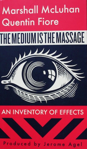 by Marshall McLuhan & Quentin Fiore
Produced by Jerome Agel
Then laugh aloud [lol], and cry encore!
—Herman Melville: Moby Dick
~For Sandee Rauenzahn wherever she may be. She had originally owned and printed her name in my first, used, paperback copy.~
Now it may seem quaint, commonplace, to say that Marshall McLuhan, when sizing up the rapidity of change of the mid-1960s, was so wonderfully acute, tuned-in, prescient. Rereading the book today, tastefully republished by Gingko Press in Berkeley, is like scanning a checklist, checking off phenomena of the future from the past and finding many matches—but also finding limitations in the prognostications. Think of those late-1940s Mechanics Illustrated covers with svelte swooping highways of the future filled with exotic streamlined autos swooshing by, images that nearly capture the reality of the future, but never quite hit the mark.
McLuhan’s other works, especially his 1962 The Gutenberg Galaxy and the 1964 Understanding Media, are rough sledding. Twentieth-century sociology is not readily absorbed. The 1967 Massage, therefore, is a welcome addition as it highlights and underscores McLuhan’s essential ideas in a manner more palatable to the hoi polli.* (The oft repeated “the medium is the message” is from Understanding Media. A deft pun remains a sign of high intelligence.) McLuhan’s main thesis is that before the invention of typesetting and printing, we lived in “an acoustic, horizon-less, boundless, olfactory space, rather than in visual space.”**  After Gutenberg, our sense of the world became linear, and this lead to the Renaissance embrace of lineal perspective and, eventually, to the assembly line, a process that also shaped our patterns of thinking and expectations. He then argues that with the coming of the telegraph and especially of the television, civilization began to revert to its village roots. The phrase “global village” is McLuhan’s. He shows how various media are extensions of man: the wheel is an extension of the foot, the book is an extension of the eye, and electric circuitry is an extension of the central nervous system. He ponders the technology that allows a raw egg to receive a printed logo. We are asked to consider a photograph of an electronic circuit enlarged “several hundred times” resting on a human fingertip—this circuit being gargantuan by today’s standards. “Art,” McLuhan tells us, “is anything you can get away with,” and he illustrates this maxim with a sculpture of a woman so large that museum goers can walk inside to explore. He discusses James Joyce and The Beatles, and he predicts the difficulties of copyright in an electronic age. His envisioned global village opening, like an enormous, beautiful flower, to a place where humankind will live harmoniously in a non-linear world.
Above, we used vintage Mechanics Illustrated covers as a metaphor for what McLuhan was attempting in Massage, and the metaphor holds—but only by way of contradiction. Those sensuous, curvaceous highways do predict the extensive and reliable Interstate System and freeways such as the New Jersey Garden State Parkway. But the highways on the MIs are smooth, free of bumps and ruts. No construction causing bottlenecks, four lanes lugubriously shifting into one. And instead of solar-atomic-hydrogen machines, today’s highway vehicles, for the most part, are still being powered by the age-old internal combustion engine. So the imperfections in the highway scenario correspond to the imperfections in McLuhan’s view of his future, our today. What he failed to see was the sheer voluminous expansion of electronic media, the astounding pervasiveness of it all. And he also failed to see the dark side of our cyber-world: terrorist chat rooms, racist websites, cyber-bullying and constant right-wing political rants are but a few sad examples. Buoyed by the optimism of his time, McLuhan had in mind for us a much better, happier world.
For those who do not read footnotes: Massage is a page-by-page— sometimes with images and text overlapping the pages—montage of fonts, illustrations, cartoons and photographs rather than a standard linear book of illustrated text. Some text is printed upside down, and two of the pages are mirror-reversed. Many of the pages come without pagination. Form marries content. The cover of the 2001 paperback edition, with the single woodblock eye, the red and the black, and the fold-over inner leaves, is both appropriate and attractive. The graphic art in Massage was originally done by Quentin Fiore; the new cover design is by Shepard Fairey.
 In Annie Hall, in a cameo role, McLuhan, standing near a theater queue, berates a teacher of media who, to his lady, had expounded pedantically on McLuhan’s ideas. McLuhan: “I heard what you were saying. You know nothing of my work. You mean my whole fallacy is wrong. How you ever got to teach anything is totally amazing.” We at SpeedReaders hold our breath.
* For an eye-opening investigation of “hoi polloi,” see the review of Rondeau & Wagstaff’s Lichtenstein/A Retrospective.
** If we were to do this exactly, we would have had to find a way to print this quotation upside down; Massage, in keeping with its thesis, is not presented linearly; it is a hodgepodge of text, font and graphics.
Copyright 2014, Bill Wolf (speedreaders.info).

 RSS Feed - Comments




























 Phone / Mail / Email
 RSS Feed
 Facebook
 Twitter
Thank you for this dedication. McLuhan really changed my way of looking at things back in the late 60’s and my professor at Queens College (Charles Turner) brought that excitement to life. I haven’t been “Sandee Rauenzahn” for many decades and didn’t pursue the career in television that I anticipated back then, but I’ve been a fairly prolific writer in computer technology (Unix and Linux). I’m glad my old copy of this book made its way into such appreciative hands.
The decision to give this book a new cover is completely wrongheaded. The book is celebrated as a design landmark that integrates image and text throughout – starting with the cover. It’s not only diminishes the effect and importance of Quentin Fiore’s overall design collaboration with McLuhan but is an insult to the intelligence of potential new readers who presumably this new cover was targeted to attract and who are now robbed of the experience of the total work.
Although I find the new cover attractive, I agree with Mr. Gee. I should have mentioned this in my review. Thank you, Mr. Gee, for your comment. —Bill Wolf