
Go Faster: The Graphic Design of Racing Cars
 by Sven Voelker
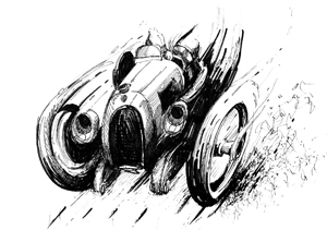
“Deformation and upheaval are the result when the second and the third dimension clash: lines which were drawn straight suddenly become curves, and the shape of sheet metal and plastics contorts the graphics which have been applied in a makeshift manner.”
First of all: You do want to know about this book.
Secondly: It’s complicated. The book, the review, everything.
If you are a motorsports enthusiast you already know that there must be hundreds, thousands of examples that could be discussed. If you are a designer you already know the relevance of graphics in communication. If you bought this book sight unseen on the strength of its title, you’d probably expect a visual primer on the evolution, purpose, and practical application of the use of graphics on racecars. Maybe an explanation of technique; maybe examples of what worked and what didn’t. The book does nothing of the sort. Not really.
On the other hand . . .
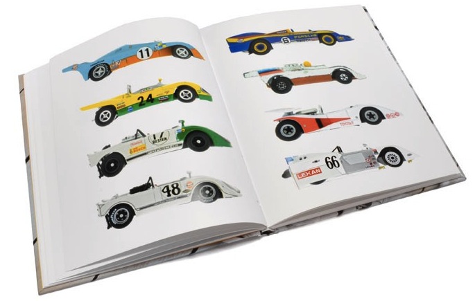
Within only a few months after its first release (January 2010 in its German home market, February internationally), when some other books are already headed for the remainder bin, this highly original book was headed for a second printing. This is remarkable, considering the love it/hate it reaction reviewers and buyers have had. This reviewer’s opinion is that the book is misunderstood, which is easy to do—because it makes no attempt whatsoever at explaining itself. It also says nothing about the author. But if you knew who he is and what he does, you might allow for the notion that he is too clever a man to have purposely weakened his book’s impact. Likewise, his publisher, a German publishing house specializing in books on design is too clever not to know that everything in this book—contents, colors, layout, typography—will provoke: the text and the photo captions are in the same font and on the same line spacing, giving the reader no visual cue which is which; two pages are randomly left blank (or are they?); the folios are on the inside of the page, near the gutter, instead of the outside; two thirds of the pages show photo after photo of 131 toy cars without any commentary. Nothing about this book is simple. Or “normal.”
But here’s the thing: if the book predigested everything and took the reader/viewer by the hand, it would rob him/her of the experience of having a reaction—and you will!—and of observing the reaction, analyzing it, and, maybe coming out at a different place than you started.
So, who is Sven “The Manipulator” Voelker? In no particular order, he is a professor, presently teaching Communication Design at the University of Art and Design in Halle and before that at the Karlsruhe University of Arts and Design where he headed the Communication Design Department. He also runs a design studio that does serious but avantgarde work for serious but probably nervous clients, for instance Voelker is responsible for the globalcorporate design of Suzuki Motor Co. His design work has received awards such as the CGI Tokyo, the Art Directors Club Award, the Red Dot, and the iF gold award. Not small potatoes.
Remember this when you feel your blood pressure rising at sentences like “The book deals with the simple fact that racing cars really only become racing cars when they are covered with colorful livery and decals. After all, who would put a plain white Ferrari on a real racing circuit or on a model racetrack” (p. 2) only to read six pages later, “The volume and the body or racing cars are determined entirely by their aerodynamics: the cars look fast because they are fast!” Any engineer, any chassis/body designer, anywatcher of racing will feel insulted by the first sentence and in vain search for the connection to the second. (It should, however, be noted that none other than Porsche’s head of design in the 1970s, Anatole Lapine, who was behind the liveries of many racing cars of that time, and the Porsche Museum in general provided input to the author and didn’t run him out of town.)
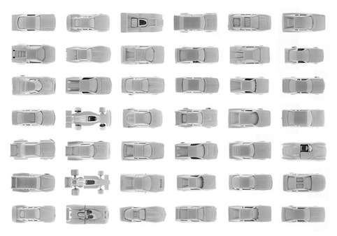
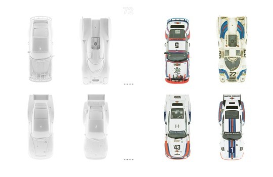
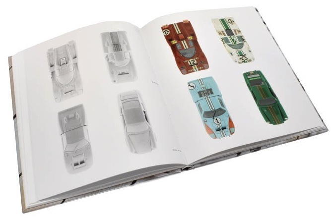
If you approach this book strictly as a motorsports enthusiast expecting to see real racecars and finally learn how Porsche’s Pink Pig came to be, continue looking. Elsewhere. What this book is about has more to do with the quote at the top. In that context it doesn’t matter that the cars Voelker shows are toys. That they are of different scales. That they are devoid of the detail of the originals. That they are all dusted with white chalk. Actually, the last item is essential. By making them all look the same and by obscuring their construction and paint features that would otherwise draw the eye and preoccupy the mind, and by juxtaposing photos of all-white, matte-finish, reflection-less cars next to their shiny (if dented) colored alter egos, the author allows you to see, to experience the different impact of pure form vs. decoration. Without words.
If you are still reading this review, you have the fortitude to tackle this book.
The publisher describes the author as a “car enthusiast” so let’s assume he is, even if some of his pronouncements on racing seem far-fetched. Upon describing the origins of national racing colors, Voelker’s main points are that initially racecar graphics were an afterthought, applied by whoever could wield a brush or cut tape; that the advent of television which allowed the viewer to keep their eyes on a car for some time instead of just having it whiz by in a flash made it essential to be able to visually distinguish them in the form of recognizable liveries and signage (coupled with sponsor signage); and that the larger, flatter WSC cars provided an irresistibly large canvas. Period photos of real cars are used to illustrate this section, from the 1903 Gordon Bennett Cup to modern WSC racing, along with dedicated Art Cars by artists such as Calder, Warhol, and Hockney. And that’s it. The rest is up to you.
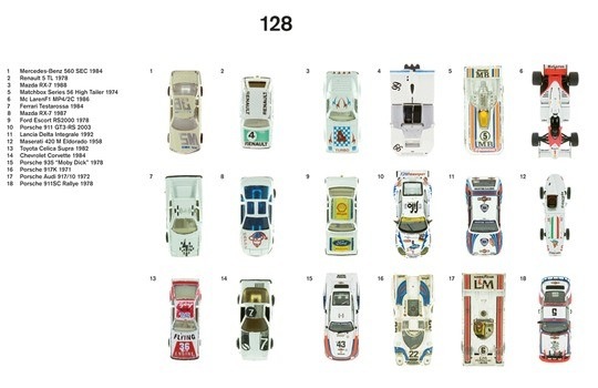
Look at the last 16 pages on which Voelker shows and names each of the 131 toy cars he used in this book (toy collectors note: no manufacturers are given). If you have eyes to see you will observe they are divided by color. And again you will make a mental note that nothing in this book is random. It may not be obvious, but it is not an accident. Ah, Art.
Copyright 2010, Sabu Advani (speedreaders.info)
 RSS Feed - Comments


 Phone / Mail / Email
 RSS Feed
 Facebook
 Twitter
Congratulations to Sabu for a review as intellectually stimulating as—apparently—Voelker’s book. This is a very compelling sales piece for a book I might not have considered before I read this review. Thank you SpeedReaders team.