Form Follows Function: The Art of the Supercar
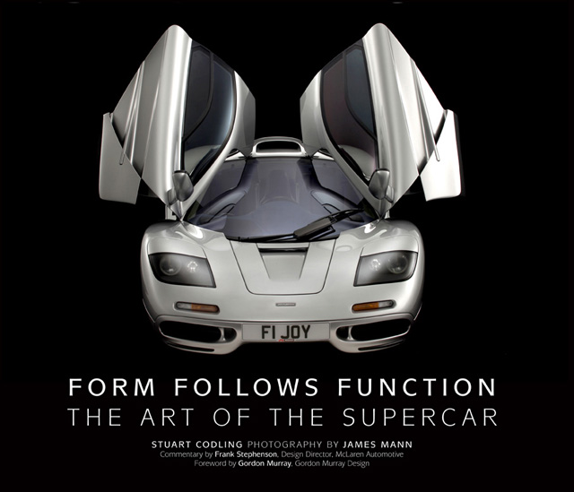 by Stuart Codling (Author) & James Mann (Photographer)
At what point does a sports car become a supercar? Is “looking the part” important? Necessary? Inevitable? Will you know it when you see it?
The book title is polarizing—and the author and his cohorts not only know it but intend it that way. There are stacks of “supercar” and “dream car” books that stitch together superficial words and random photos of sexy cars as an excuse to inflict yet another vapid book upon the world. Not this one.
The book does not by any stretch of the imagination intend or pretend to have settled the argument of whether the shape of an object should be primarily based upon its intended function. Specifically, if “ornamentation”—in this case bodywork—should be, as motoring journalist Codling puts the question, “abhorred”?
The handy “form follows function” phrase has become shorthand for a way of thinking that is so dogmatic as to render itself, in the final analysis, meaningless. When American skyscraper architect Louis Sullivan first used it in his 1896 article “The Tall Office Building Artistically Considered” he used one more word that made it even more dogmatic: “form ever follows function,” pronouncing it “a pervading law” applicable to “all things human and super-human . . . physical and metaphysical.” His assistant, one Frank Lloyd Wright, preached the same gospel. The very first sentence in the Foreword has Gordon Murray (of McLaren fame and with a good number of other iconic designs to his name) saying that he too subscribes to it. And there you are—right in the thick of things, where the writers want you, asking questions.
One question you should ask—and the writers do not—is whether buildings (“machines for living” as Le Corbusier called them) and cars even have a comparable function. Should a car be measured by that yardstick? If a car’s function is to get you from A to B, isn’t a Fiat as adequate as a Ferrari? Auto designer Frank Stephenson, who provides commentary on the cars included here, modifies the phrase to “form equals function.” Does that work better?
To get you to think about these things, 21 cars are presented, in loosely chronological order, from a 1954 Gullwing Mercedes to a 2011 McLaren MP4-12C (one of the aforementioned Stephenson’s designs). Each car is covered on about 10 pages. The narrative, by Codling, offers remarks about the marque, the specific model, with a focus on technical and design particulars along with tables of basic car specs. Stephenson’s commentary is set into a black box and consists of a few sentences that range from the sometimes very specific to the, well, less so. Still, it is interesting to hear a designer think out loud. Conjure up an image of a BMW X5 or the modern Mini Cooper, or Ferraris 612 and 430 and you’ve seen his work.
It is utterly and completely inevitable that some readers will quibble with the selection of cars here. Remember, the point of the book is not to be a universal catalog of the supercar genre but to illustrate different interpretations of the form/function conundrum. And there’s another complication, the one at the heart of Murray’s Foreword: what is a supercar? What is the point of demarcation between it and a “mere” sports car? On that score it is as futile as it is interesting to ponder the cosmic significance of early press notices saying the book would include 22 cars and then find only 21. The missing car is the Corvette Z06, the high-performance version of the C5 Corvette. No one can seriously argue that the Z06 isn’t a legitimate sports car but many would probably think the sky had fallen to see it accorded the supercar moniker and share the stage with a Jaguar XJ220 or a Miura. At one point the book’s working title was Art of the Exotic Car and maybe the change in title/scope bumped the Z06 from the list. Whatever the reason, it perfectly illustrates that nothing is simple. And that dogmatism is divisive. People who want to see shortcomings in the book will find them.
For everyone else there are the photos, the splendid James Mann photos. Each car is shown full frontal, front and/or rear ¾, full profile, and sometimes overhead along with any number of close-ups. Many of the photos take up the whole page. Thinking observers will quickly notice something. The book jacket trumpets that all cars were shot in the studio, against a black background. If you read the Foreword and Introduction you would have read about the importance of a car’s overall shape, its stance and its proportions. Wheels are a key factor in how you read a car. Tires are black. You cannot see a black tire against a black background, certainly not in the full frontal shots—which makes the cars look as if they’re floating in space. Good choice? Talk amongst yourselves. In the side views you can mostly see the black rubber, but only just. Supercars don’t normally have whitewalls or other colors or lettering on the sidewalls—imagine how odd disembodied colored circles would have looked against a black background. Mann is too sophisticated a photographer not to have considered this, so why not tell the reader what his thinking was?
The book is very nicely designed, by the same designer who did Codling’s first book which grappled with the same form/function question but applied to F1 cars. Codling, incidentally, seems to be on a roll—this is his third book since 2010.
A lot of book for the money, and certainly more than “just” another picture book.
Copyright 2011, Sabu Advani (speedreaders.info).

 RSS Feed - Comments
































 Phone / Mail / Email
 RSS Feed
 Facebook
 Twitter