
The Ferrari Book: Passion for Design
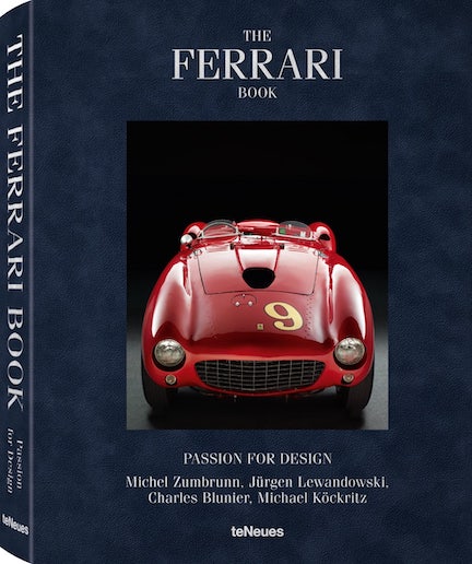 by Jürgen Lewandowski
(English, German, French, Italian) If you already had a book with this same title on the bookshelf, you’d not have forgotten it. It’d be as tall as this one and by the same publisher, and you probably pick it up often because the Günther Raupp photos—and their elaborate post-shoot treatment—are just so spectacular.
This new Ferrari book has a quite different flavor and, to the extent that this way of thinking even applies, purpose.
We’ve presented books by this German art/lifestyle publisher often enough to no longer dwell on what “species” of book this is and will only say, politely, that you best think of it as a trip to the museum (or for car people, concours) rather than the lecture hall. The concours image is particularly apt because there too you will not get a chapter-and-verse “education” as to what exactly you are looking at but are expected to do your own homework, elsewhere, if so inclined.
There’s another image that presents itself: the press release says the book’s “clean and uncluttered layout ensure[s] the proper presentation worthy of the vehicles from Maranello.” This is more true than the writer could have intended: some, why, many of those “worthy vehicles from Maranello” have absolutely infuriating quirks in regards to function and ergonomics, and so does this book too. We shall return to this aspect later. For now let’s just note that the book has neither Table of Contents nor Index, grist for the mill of the anti-coffee table book brigade.
FERRARI 412 P, 1967 Photo © Michel Zumbrunn
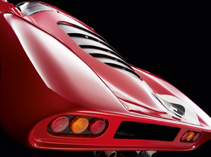
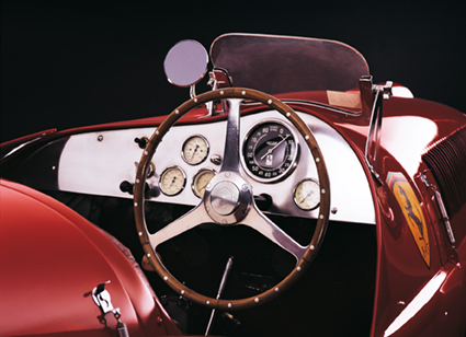
A clue to this book is its subtitle, Passion for Design: mini bios of four designers (S. Pininfarina, Manzoni, Fioravanti, Scaglietti) along with photos of their work or studios are interspersed with the 40-odd cars from 1947 to 2015. The cars selected are not necessarily by those designers, nor is there any other intrinsic criteria discernible. They certainly are photogenic, as so many Ferraris are. Of course, Michel Zumbrunn could make a slug look sexy. . . . The studio shots were done under similar conditions (lighting, black background, perspective etc.) which some may, and did, call repetitive, or worse. But think about it; it helps “compare” one design to another, behold the shapes, perceive their essence. That they are flawless in terms of photographic technique and state of the art reproduction in print is a given with this publisher.
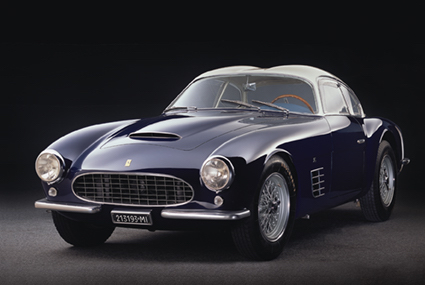
FERRARI 166 SPYDER CORSA, 1948 Photo © Michel Zumbrunn
So, a photo book totally has its place (and at 15″ tall and almost 10 lb this one very much will need its own place). Granted, being multilingual—four in this case—does cut into the available real estate for text and imposes a certain brevity, but this book either does not try very hard or is trying too hard. Our vote is the latter.
This Ferrari book is one of several in recent years that teNeues has developed together with a German entity called ramp.space, formerly Red Indians, whose forte is design-intensive publishing of lifestyle and brand-management material. Ten years ago they launched a quarterly magazine, more or less in the automobile domain, that made a splash mostly because it looked so different. Its founder, Michael Köckritz, is listed here as editor. Another name needs to be considered, that of Swiss designer Charles Blunier whose studio also is a big name in the brand- and image-massage world. There is no arguing with these folks’ professional successes—but this book has annoying, objectively annoying quirks. Consider the one page of text that precedes the several pages of photos of each car. Each of the four languages is printed in the same font and typestyle, separated by a line space as one would separate paragraphs. You finish reading one and your eyeballs automatically move to the next—and it then takes a conscious effort to process that you are now in a different language and could stop reading. Or consider the captions. They are printed in the margin of those opener pages, i.e. they precede the photos. Not a problem. Except, in some cases, multiple versions of a model may be shown—but the caption only talks about, say, two of three. What is the point??
FERRARI 250 GT BERLINETTA TDF, 1956 Photo © Michel Zumbrunn
And one more, just because: three different 250s are shown, as separate entries and thus in suitable detail. And then, 250 pages later, a 1958 Le Mans photo of a 250 pops up, stuffed between a 2013 LaFerrari and a 2015 F12. Totally random, or did someone try to be extra clever and put a 250 250 pages after first writing about it just to see if anyone figured it out? Again, what is the point?? If this is the best these high priests of design can do, it’s time for re-indoctrination, gentlemen. The “form/function” question applies to books as it does to any designed object. In that context, form that undercuts function speaks of ignorance—and arrogance.
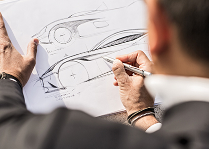
Flavio Manzoni Photo © ramp.space
Just for the sake of laying it all out, there are several other period photos of Ferraris that are not the featured cars and so serve no other than a decorative purpose. Newbies won’t even think twice and the expert will—almost—see how they sorta/kinda are not unrelated to the context (see Ferrari 330 P4 and 328 GTB/GTS).
The foregoing should not dissuade anyone from embracing the merits of this book. If you know print technology, if you buy photography, if you want a conversation starter in your library, office/garage, (bedroom??)—this book is a bargain even at its $150 MSRP.
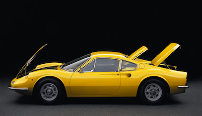
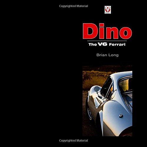
FERRARI 246 GT DINO, 1969 Photo © Michel Zumbrunn
Copyright 2020, Sabu Advani (speedreaders.info)
 RSS Feed - Comments


 Phone / Mail / Email
 RSS Feed
 Facebook
 Twitter